

§ Avandiz Studio • Case Studies
Making room for the art — and the business around it
Bringing commissions, direct sales, classes, and studio services together in one digital home: expressiveglass.com

Vicki Schneider is a flameworking artist, educator, and founder of Expressive Glass, a working glass studio in Buffalo, New York.
Her business had evolved considerably over the years. She’s been creating commissioned glass sculptures for collectors and galleries, teaching students, renting studio space, and selling smaller glass creations.
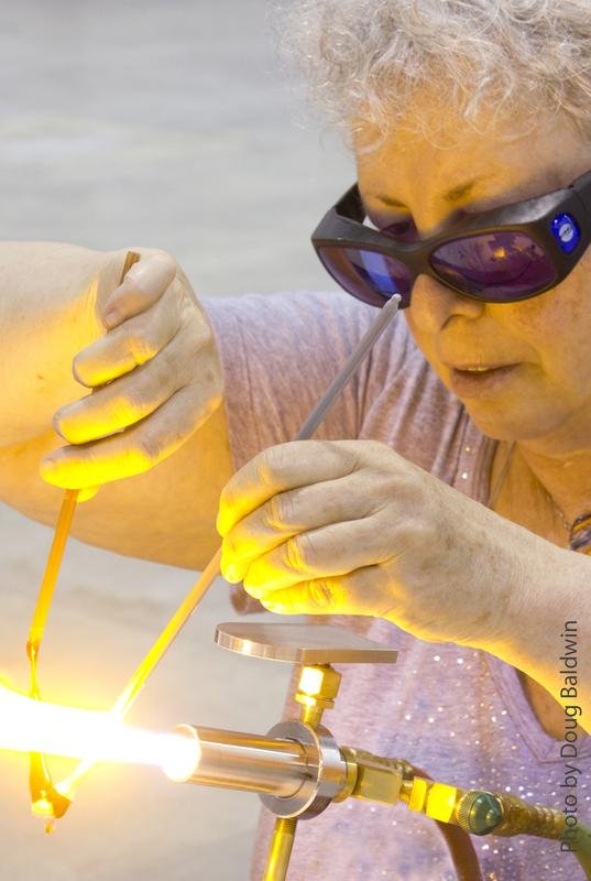
Vicki had built and maintained the Expressive Glass website herself for many years. Created around 2010, it became a hardworking digital home for the studio — showcasing her art, introducing classes and services, sharing information with students and collectors, and growing alongside the business.
Over time, however, both Vicki’s work and the studio had expanded considerably. The website had accumulated a wealth of content, new services, and information, and the original structure was becoming harder to maintain and navigate. It also offered limited opportunities to showcase Vicki’s increasingly visual body of work at the scale it deserved.
Some parts of the business had gradually moved to separate third-party services: smaller pieces were sold through Etsy, classes relied on a scheduling platform that had become expensive and lacked features such as automated reminders, while hosting and other digital services added further costs. The process for commissioning a sculpture had also grown more complex as Vicki’s offerings evolved.
The website had served Expressive Glass well for many years. The challenge now was to build on everything Vicki had created — preserving the knowledge, personality, and functionality of the original site while reorganizing it around the way the studio works today.
So rather than simply redesigning the website, we looked at the studio’s digital presence as a whole.

Vicki’s original website — built and maintained by her as Expressive Glass grew.
The Challenge
Expressive Glass had several interconnected problems.
An outdated visual experience
Glass is an intensely visual medium, yet the old website gave Vicki’s work relatively little room to speak for itself. The design, image sizes, typography, and layouts no longer reflected the detail, color, and craftsmanship of the artwork.
Sales and business tools spread across different platforms
As the studio grew, its website, ecommerce, scheduling, and other digital tools had developed independently rather than as one connected customer experience. For example, Vicki’s smaller pieces were sold through Etsy rather than directly through the Expressive Glass website.
Our goal was to bring these different parts of the business together, making the website the central hub for the studio’s digital presence.
A difficult commission process
Vicki’s signature glass flower sculptures are an important part of her work, but the old commission process relied on a tier system that was not intuitive to someone encountering the work for the first time.
Step 1 — Structure Before Design
We didn’t begin with colors or layouts.
We began by restructuring the website.
We mapped the different sides of the business and developed a new site architecture around the things visitors actually come to Expressive Glass to do: discover the artist, explore her work, commission a piece, take a class, buy something, purchase a gift certificate, or use the studio.
From there, we created a complete text prototype of the new website.
The structure, messaging, and copy went through several rounds of revisions with Vicki before we moved into visual design. This allowed us to solve the content and user-experience problems first and let the design grow from a clear foundation.
The result was a much simpler content system in which every major part of the business had a clear place and purpose.
Step 2 — Refreshing the Identity
Vicki was very clear that she wanted to preserve the original Expressive Glass identity, so we kept the existing shapes and character of the logo while giving it a careful refresh.
The original version was very light and tended to get lost within the website, so we strengthened the colors and refined the artwork to make the logo more noticeable and visually confident.
The result is a cleaner, more polished identity that still feels unmistakably like Expressive Glass, but works much better within the new website.
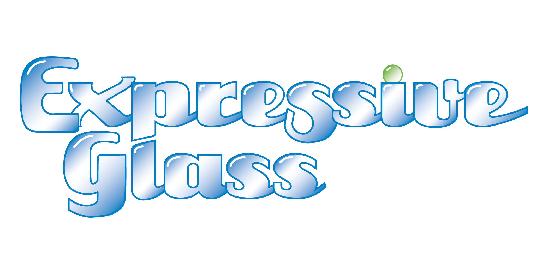
The original logo
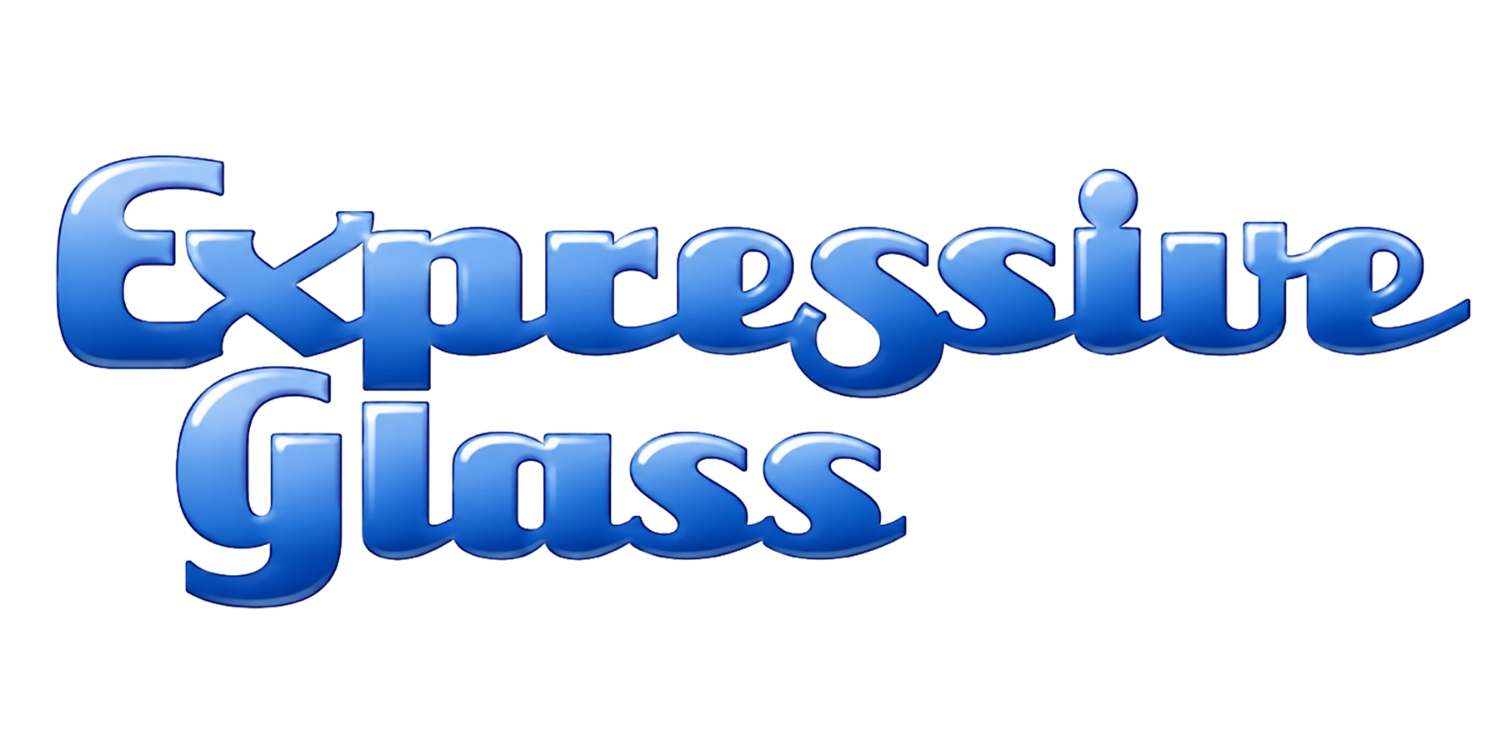
Refreshed colors, stronger presence
Step 3 — Letting the Art Lead
With the structure established, we designed a contemporary, image-led website around the artwork itself.
Large photographs, generous spacing, cleaner typography, and simplified navigation replaced the denser presentation of the old site.
Instead of treating images as illustrations for the text, the new design lets the artwork become part of the experience.
This was especially important for Vicki’s signature body of work: her glass flowers.

Before: Artwork surrounded by dense text and competing information.
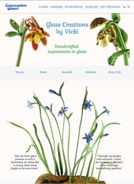
After: Large-scale imagery lets the artwork lead the experience.
Mama’s Garden
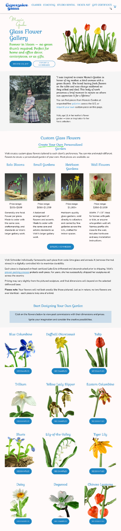
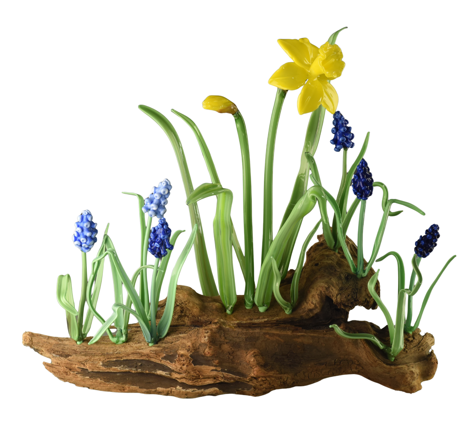
We built the largest gallery around Mama’s Garden, Vicki’s principal body of work — individually crafted glass flowers directly commissioned by collectors and sold through galleries across the country.
The website gallery gives visitors space to explore the variety, detail, and character of the work while also serving a commercial purpose: helping a potential collector understand what Vicki can create before beginning a commission.
Other parts of the site present additional bodies of work and smaller creations, including murrini beads, glass seashells, and other pieces.
The website became not simply a portfolio, but a curated digital exhibition of the artist’s work.
After
The new gallery combines larger imagery with clear commission options and pricing.
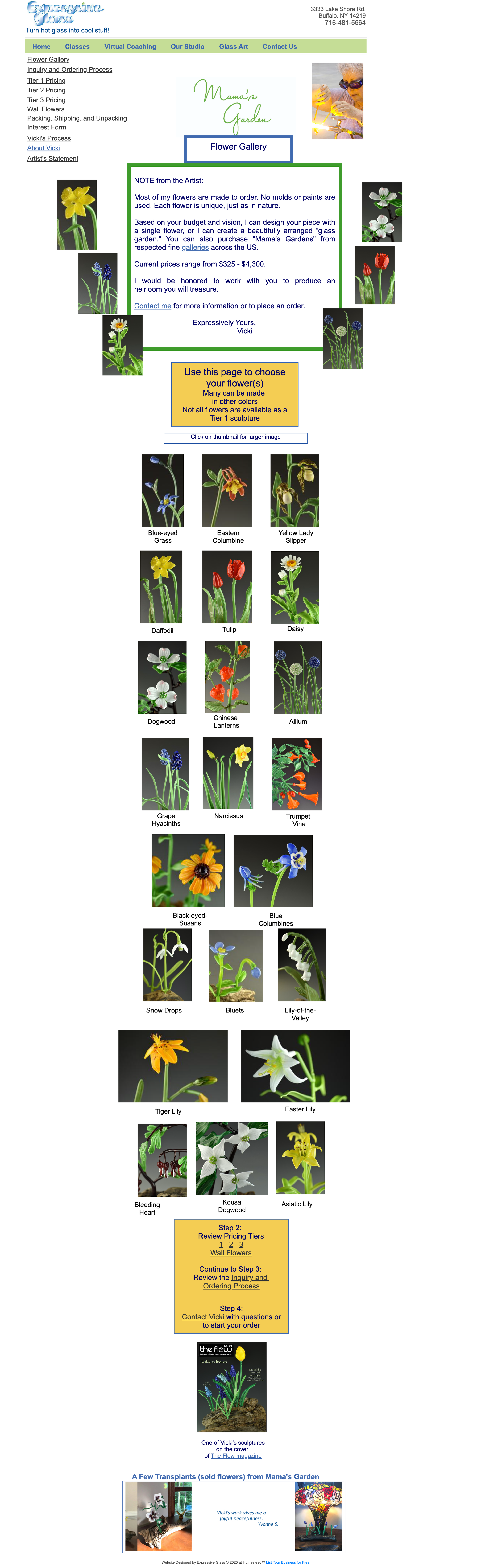
Before
The original Mama’s Garden organized Vicki’s flowers into a practical visual catalog.
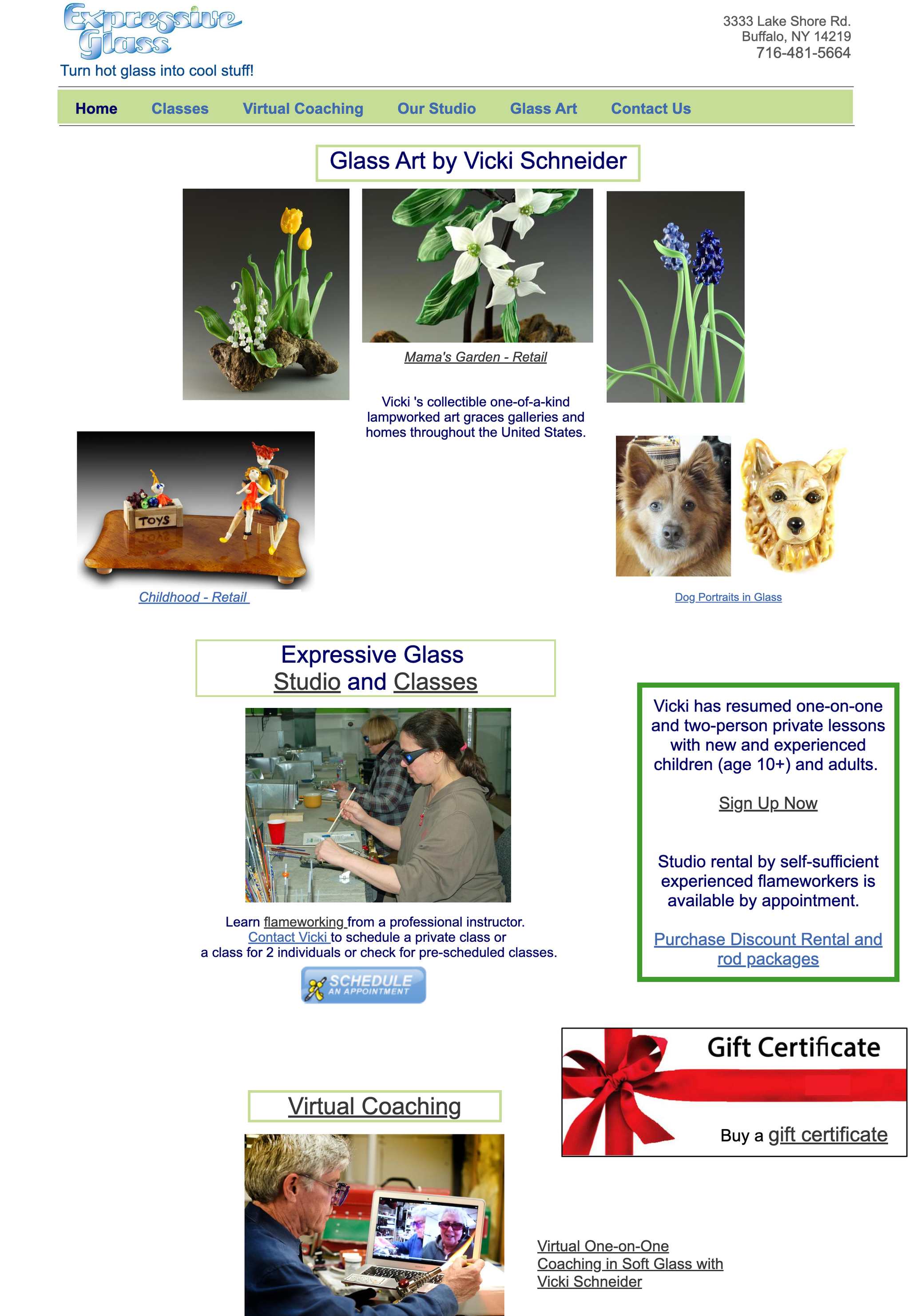
Before: The old site lacked a clear structure and used images that were too small to showcase Vicki’s art in its full beauty.
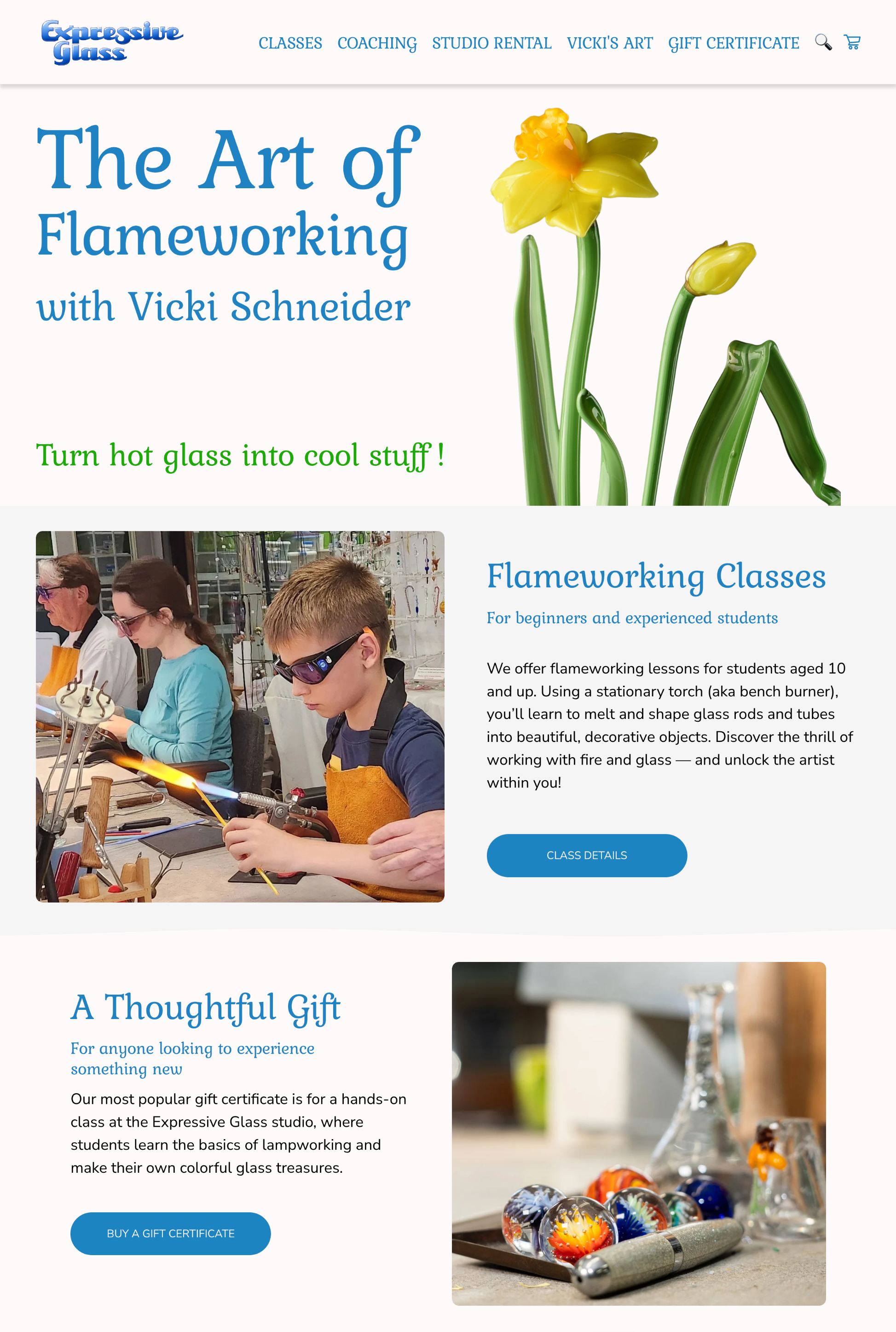
After: The redesigned homepage gives Vicki’s art room to shine, with a clear structure and large, immersive imagery.
Step 4 — Making Commissions Easier to Understand
The way commissioned work was presented had become increasingly complex as Vicki’s offerings evolved.
Together with Vicki, we rethought how commissioned work should be presented, organizing it around examples of her past commissions.
Collectors can now see what kinds of pieces they can commission, what the finished work might look like, and what options are available to them.
Instead of asking visitors to navigate several pages covering different parts of the commission process, we brought the essential information together and created a simple inquiry form. Clients can choose what they’re interested in, share the basic details of their idea, and start a commission request directly from the website.
For an artist whose major pieces are individually commissioned rather than simply added to a shopping cart, making that path easier was especially important.
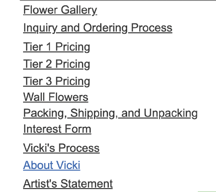
On the old site, potential buyers had to navigate a tiered structure that made sense internally but could be difficult for someone unfamiliar with Vicki’s work to understand.
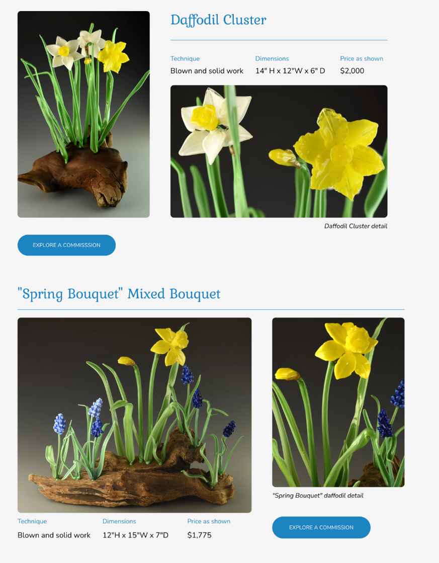
On the new site, past commissions give collectors a clear starting point for imagining their own piece.
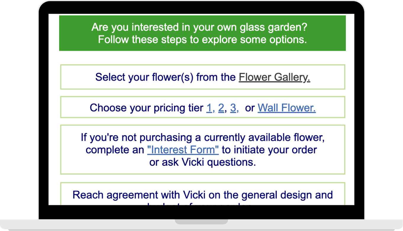
Before: The process for ordering commissioned work was complicated. Visitors had to follow multiple links and navigate a lot of information before making a decision — and then contact the artist by email to place an order.
After: A simple inquiry form now lets clients choose what they’re interested in and start a commission request right from the website.
Step 5 — Bringing Ecommerce Home
Vicki had previously relied on Etsy to sell smaller creations. That provided a sales channel, but it also meant paying marketplace fees and sending customers away from her own brand.
We built a native online store directly into the new Expressive Glass website.
Visitors can now discover Vicki’s work, learn about the artist, and purchase smaller pieces without leaving the site.
We configured the product catalog, checkout experience, Squarespace Payments, and PayPal, creating a direct sales channel that Vicki controls herself.
The store is now an active part of the business rather than a design concept: the new website has already been used to process real customer transactions.
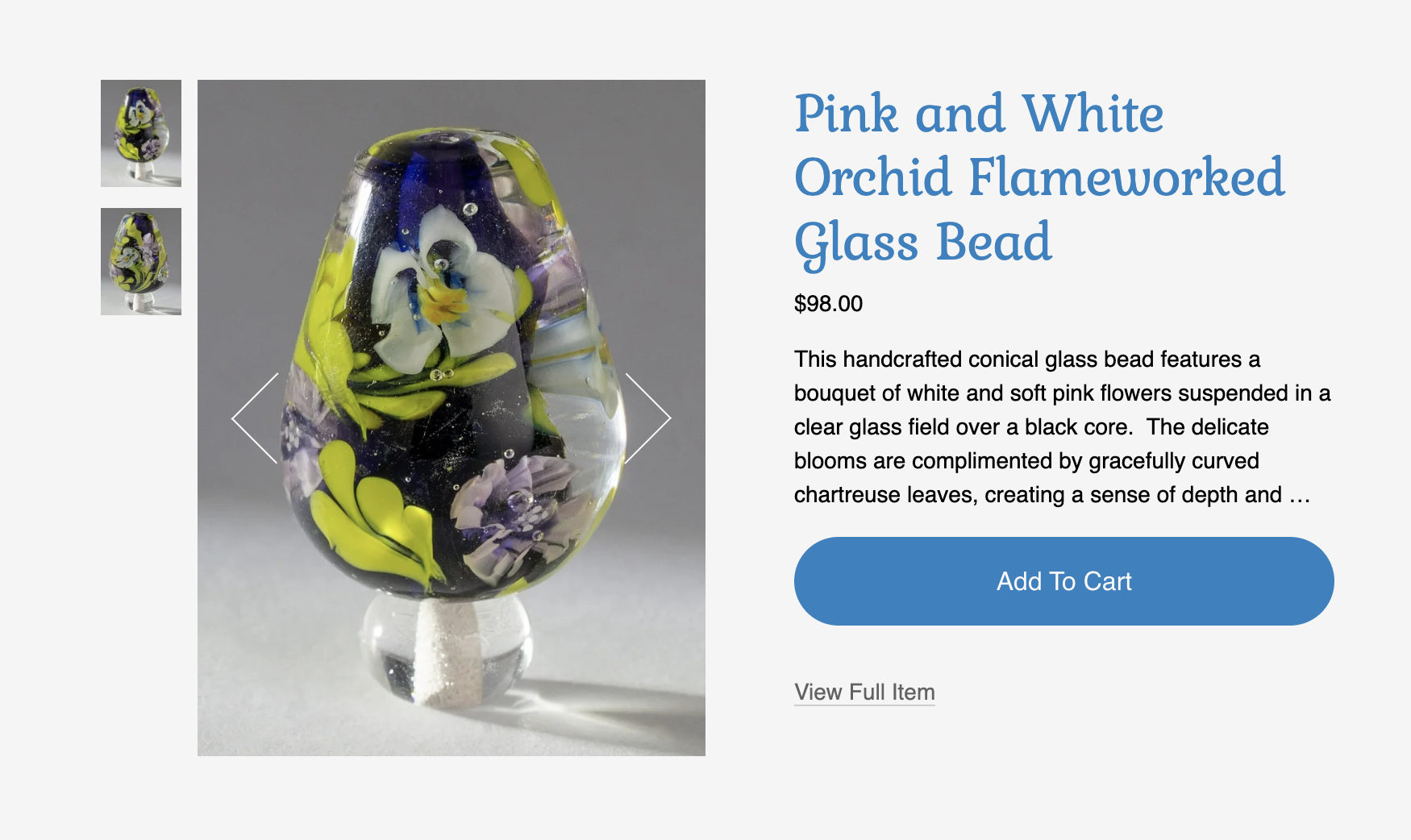
Individual product pages give each piece its own imagery, details, price, and direct path to purchase.
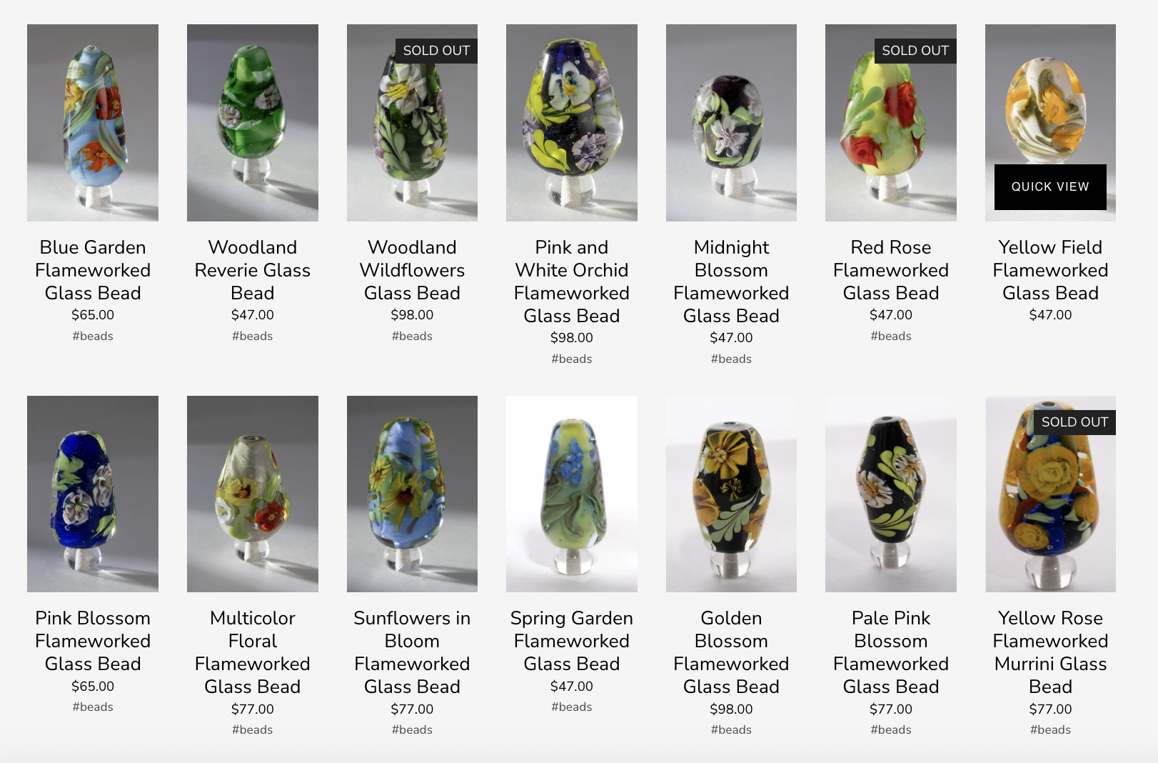
A dedicated online store keeps Vicki’s smaller works within the Expressive Glass experience.
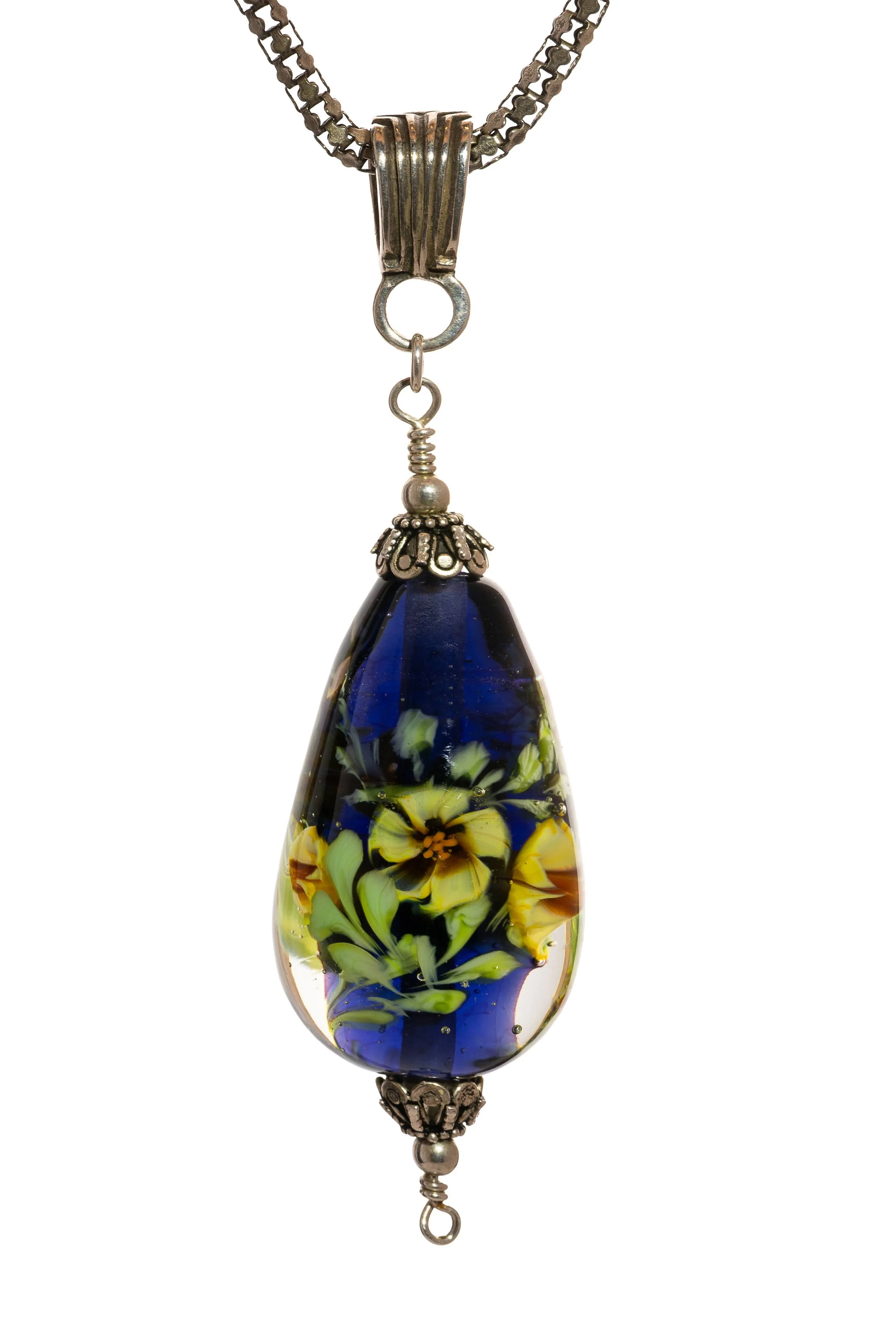
Step 6 — Creating the Product Photography
Building a store created another challenge: the products needed to look as good online as they do in person.
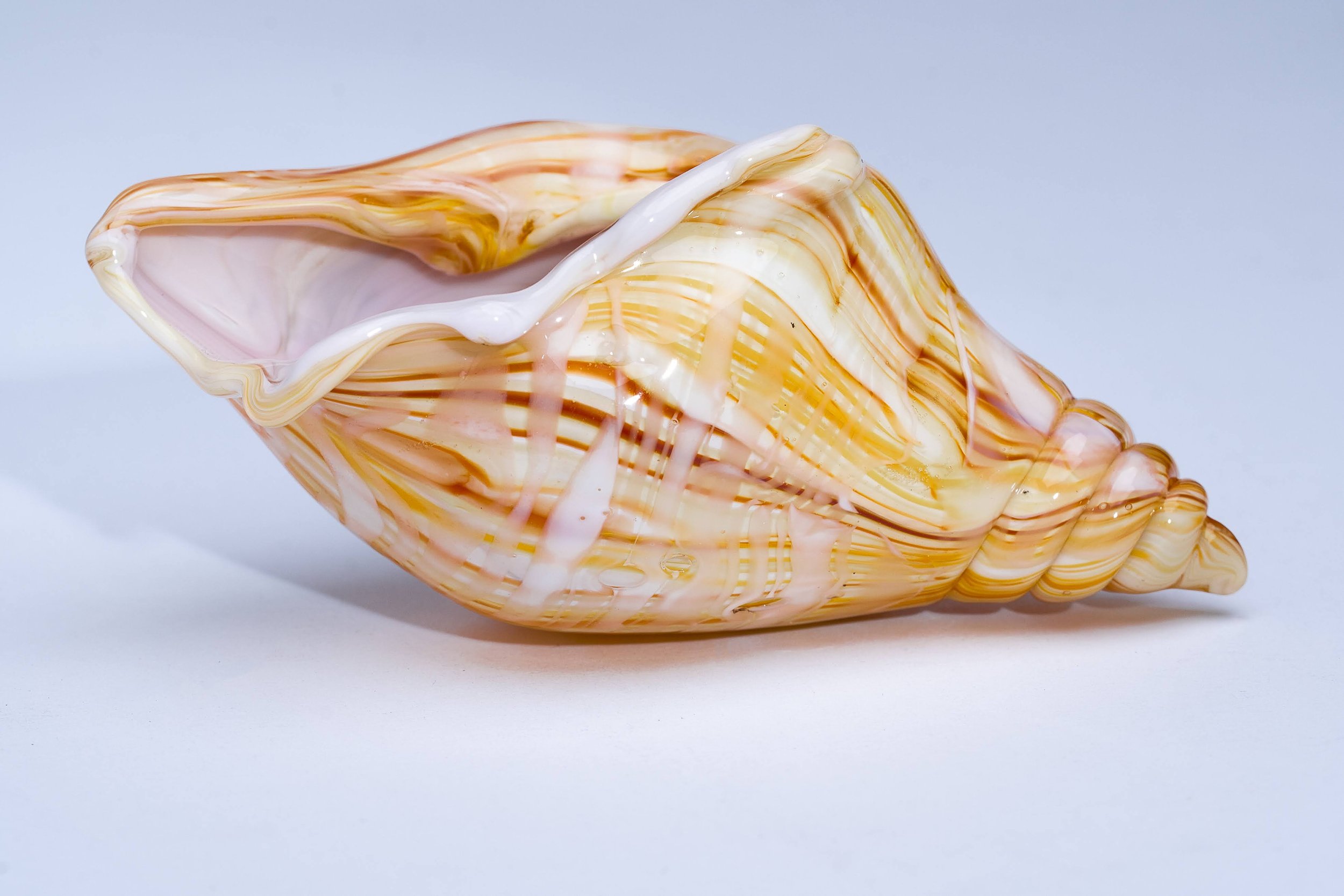
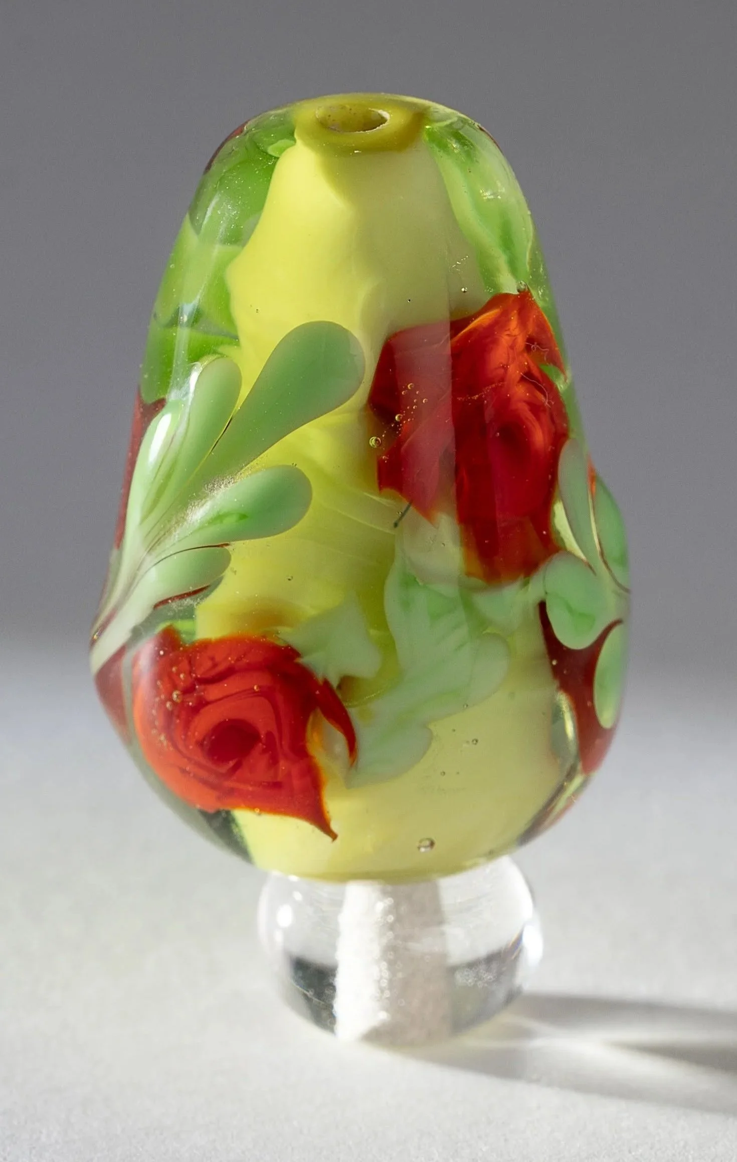
Small translucent glass objects are particularly demanding to photograph. Color, reflections, scale, background, and lighting can dramatically change how the piece is perceived.
We produced dedicated ecommerce photography for Vicki’s Murrini beads and glass seashells, working toward a consistent visual presentation across the store.
The photography was developed specifically around the needs of ecommerce: clean backgrounds, visible detail, accurate color, and consistency between products.
This gave the smaller works a presentation worthy of the craftsmanship behind them.
Step 7 — Turning Classes Into a Clear Offering
Expressive Glass is not only an artist’s studio. It is also a place where people learn flameworking.
The new Classes section was designed to answer the questions a prospective student actually has:
What will I learn?
What should I expect?
What does the studio provide?
How do I schedule my class?
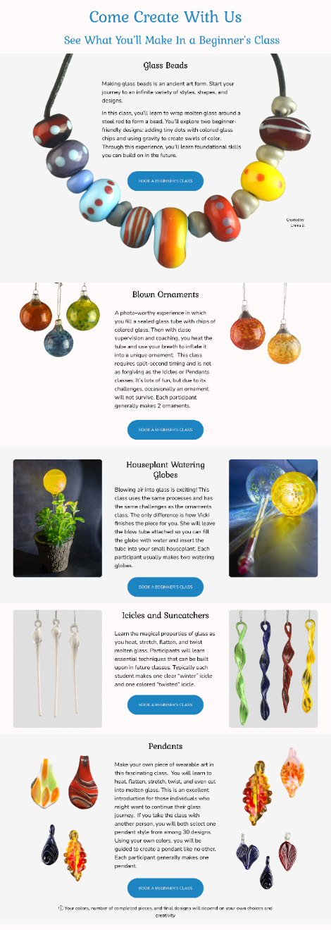
We also created a gallery featuring actual student work.
This gives Vicki’s students recognition for what they have created while serving another important purpose: prospective students can see real examples of what people have learned to make in her classes.
Instead of merely promising an experience, the site shows the results.
We also simplified several supporting revenue streams.
The previous scheduling service was expensive. We migrated class scheduling to a clearer system and connected it to the new website, making it easier for students to move from discovering a class to actually booking it.
We built out online gift certificate purchasing and created branded certificates that could work both digitally and in print.
The new site also presents studio rental and private practice opportunities more clearly.
Step 8 — Scheduling, Gift Certificates & Studio Rental
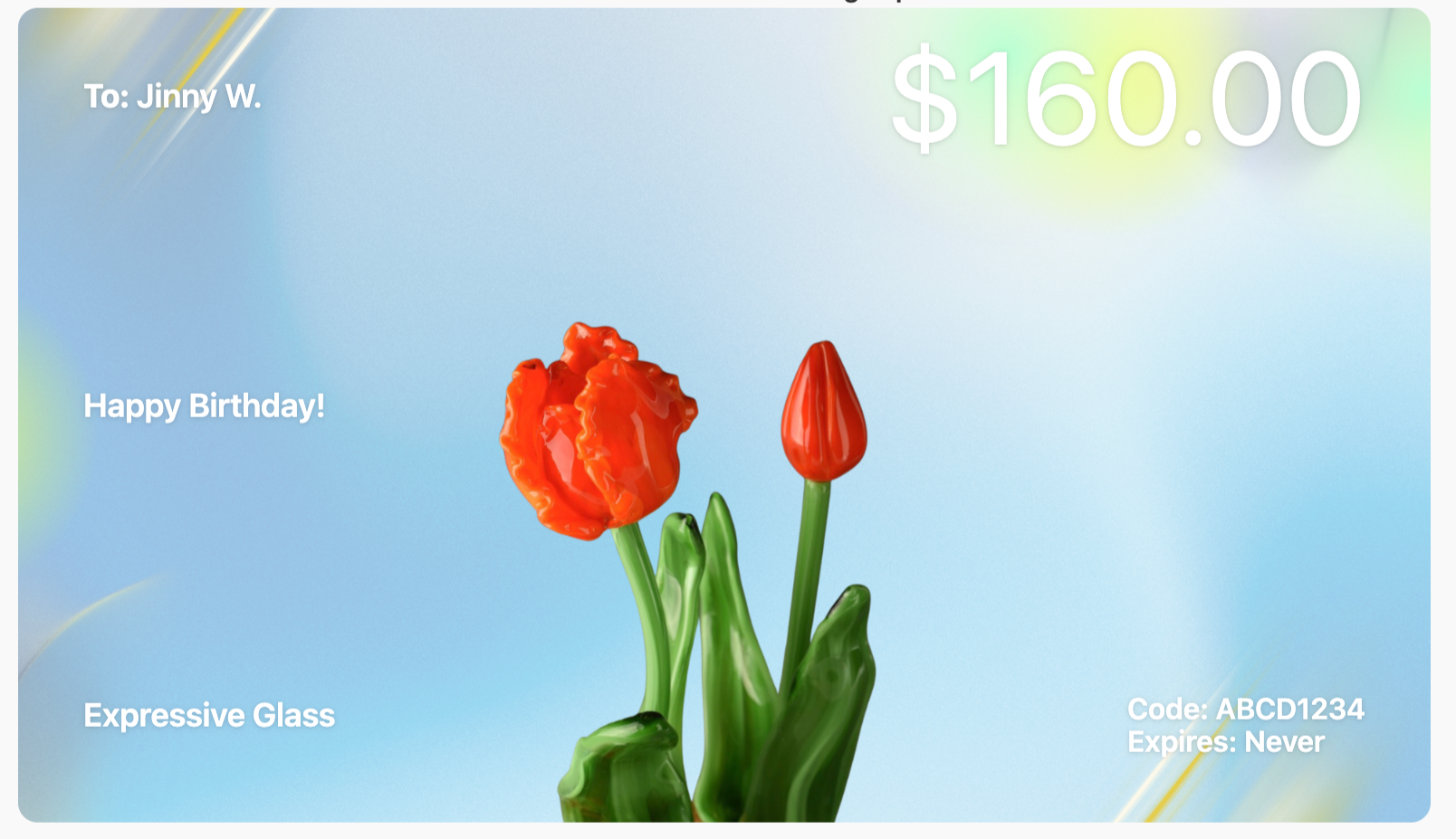
Branded gift certificates can be purchased online and used digitally or in print.
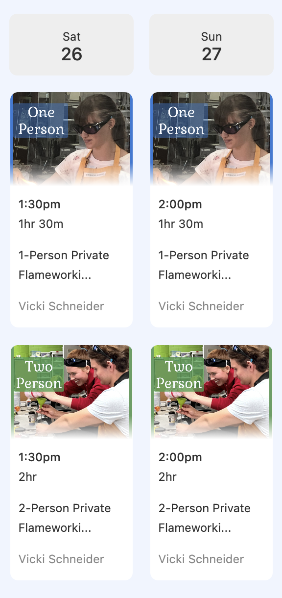
Students can see available class times and book directly online.
For collectors, galleries, students, and media, understanding the artist matters almost as much as seeing the work.
We created a comprehensive illustrated biography that presents Vicki’s artistic journey, professional development, training, influences, credentials, exhibitions, and recognition.
Instead of a short generic About section, the biography gives visitors context for the decades of work behind what they see in the galleries.
It also provides the kind of professional background that matters when a potential collector or gallery is considering the acquisition of an artist’s commissioned work.
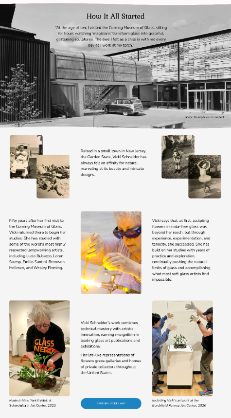
Step 9 — Telling the Artist’s Story
Step 10 — Moving the Business Without Breaking It
A redesign was only half of the job.
The old website was already connected to the studio’s domain, email, customers, scheduling, and years of online history. Vicki’s biggest concern was simple: Will everything still work when we move?
So we treated migration as its own project.
Rather than immediately replacing the live website, we first built and tested the new site separately. We preserved the old site’s content and assets, tested functionality, and only then moved the finished website to the established Expressive Glass domain.
The migration included:
moving the website to Squarespace
preserving and mapping important old URLs
implementing redirects to prevent dead links
connecting the existing domain
configuring payments
migrating scheduling
checking indexing and search visibility
testing the production site after launch
This staged approach reduced risk and allowed the business to continue operating throughout the transition.
Step 11 — Moving Email to Google Workspace
The infrastructure modernization continued after the website launch.
We migrated the studio’s professional email from its legacy environment to Google Workspace while preserving the existing Expressive Glass email address.
The process included mail migration, DNS and MX configuration, incoming and outgoing mail testing, and configuration across the devices and applications Vicki actually uses.
We also worked through the practical post-migration issues that can occur when an established business changes systems — including Outlook, iPhone Mail, and Sent-folder synchronization.
The goal wasn’t simply to “set up email.” It was to make sure the owner could continue working normally after the underlying technology changed.
Step 12 — Protecting Search Visibility
Moving a website that has existed for many years carries another risk: old links don’t disappear just because the website changes.
We mapped legacy URLs to their new destinations and implemented redirects so visitors — and search engines — wouldn’t be sent to dead pages after the migration.
We also worked on page titles, descriptions, indexing, Search Console, site structure, and SEO for key artwork and gallery pages.
The goal was not only to launch a better website, but to preserve the value the old one had accumulated and create a stronger foundation for future search visibility.
Step 13 — Launching the Site With an Audience
We didn’t want the project to end with quietly pressing “Publish.”
We helped Vicki introduce the new website to her existing audience through an email campaign built around the launch.
Rather than simply announcing “we have a new website,” Vicki turned the launch into an interactive scavenger hunt that encouraged customers and students to actually explore it.
Participants were invited to find information across the new site and received incentives including class coupons, with additional prizes offered through a drawing.
The campaign turned the website launch itself into an opportunity to:
reconnect with existing customers
introduce new services
encourage exploration of the redesigned site
collect feedback
promote classes and artwork
The website was not simply launched. It was put to work.
A launch email invited Vicki’s audience to explore the new site through an interactive scavenger hunt.
Results
What began as a website redesign became a broader
modernization of the studio’s digital presence.
Expressive Glass now has:
a contemporary, image-led website
a clearer commission journey
a direct ecommerce store
professional product photography
online payments with automated sales tax calculation
integrated class scheduling
student work galleries
gift certificate sales
studio rental information
a comprehensive artist biography
a modern professional email system
a stronger SEO foundation
a platform Vicki can manage more easily herself
Most importantly, many pieces that previously lived across separate services now work together under one brand and one digital home.
The new site doesn’t simply show what Expressive Glass does. It helps the studio do business.
A long-term, collaborative project completed over several months. The scope grew along the way, expanding from a website redesign into ecommerce, scheduling, photography, email migration, SEO, and launch support. A more focused website project would typically have a much shorter timeline.
What Changed
Before
An established artist and studio operating through a visually outdated website and a collection of disconnected digital tools.
After
A modern, integrated platform built around the way the studio actually works — presenting art, attracting collectors, selling directly, booking students, and supporting multiple revenue streams.
Our Role
Website Strategy
Information Architecture
Copywriting & Content Restructuring
UX Design
Website Design
Logo Refresh
Ecommerce Setup
Product Photography
Commission Journey Redesign
Scheduling Integration
Gift Certificate Setup
Platform & Domain Migration
Google Workspace Migration
SEO & Redirect Strategy
Email Launch Campaign
Training & Ongoing Support
In Vicki’s Words
“I’m extremely pleased with the website AVANDIX Studio designed and implemented for my business, Expressive Glass. The feedback I’ve received from customers has been enthusiastically positive, finding the site attractive, comprehensive, and easy to navigate.
During the development process, Ilya took the time to understand my goals and educate me about how he was going to help me achieve them. He worked tirelessly to create my site and successfully transition it from the old to the new. Ilya was knowledgeable and served as a valued partner, always receiving my ideas and requests for assistance quickly and calmly.”
Vicki Schneider
Artist & Owner, Expressive Glass
Final Thought
A small business can outgrow its website long before it realizes it.
For Expressive Glass, redesigning the site meant more than changing how the business looked online. It meant bringing years of art, teaching, sales, and studio operations into a digital system built for where the business is today — and where it can go next.